



Mobile application design is no longer limited to a single smartphone screen.
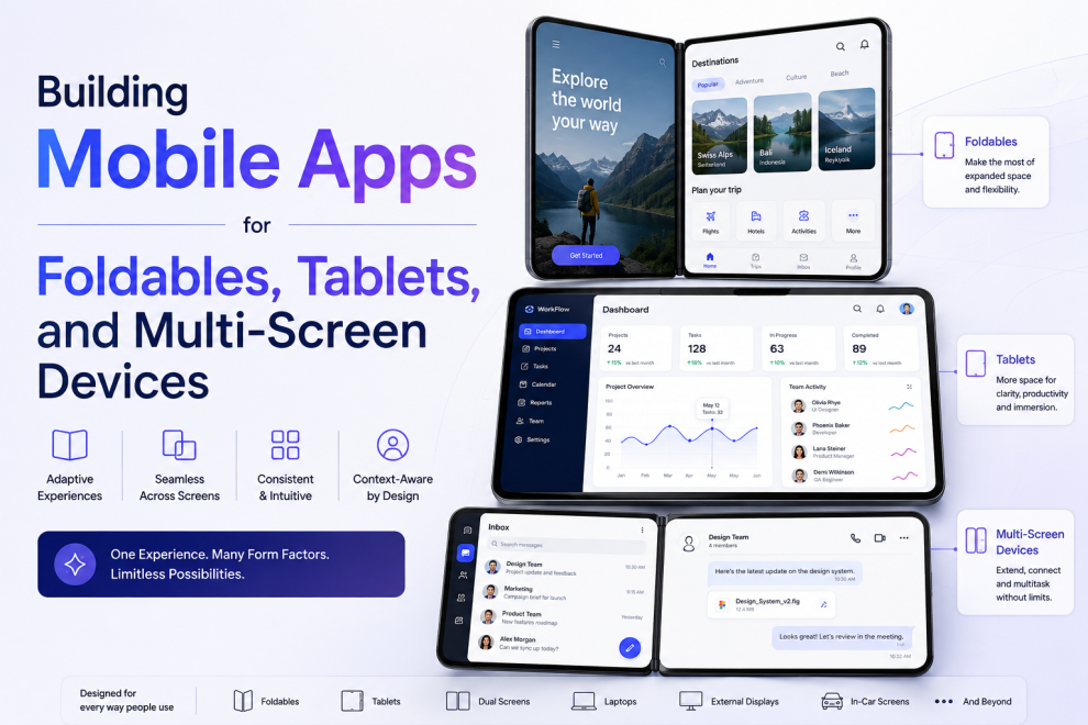
Foldable phones, tablets, larger displays, split-screen environments, and different device orientations are creating new possibilities—and new engineering challenges—for mobile development teams.
An application that works well on a conventional phone may not automatically provide a good experience on a larger or changing screen.
For product teams, the goal is therefore not simply to make an application responsive, but to build an interface and architecture that can adapt to different device contexts.
Why Mobile Screens Are Becoming More Diverse
Users can now interact with applications across different form factors.
These can include:
- Compact smartphones
- Large smartphones
- Foldable devices
- Tablets
- Desktop-style mobile environments
- Split-screen layouts
Each environment changes how much information can be displayed simultaneously.
A screen designed for a 6-inch phone may waste significant space on a tablet.
Responsive Layout Is Only the Beginning
A responsive interface changes dimensions based on available space.
Adaptive mobile UX goes further.
It can change:
- Navigation
- Content hierarchy
- Number of visible panels
- Interaction patterns
- Typography
- Component arrangement
For example, a mobile application might use:
Single-column layout on a phone
while showing:
Navigation + content + detail panel on a tablet
The underlying workflow can remain the same while the interface takes advantage of the available space.
Foldables Introduce New Interaction States
Foldable devices create an unusual challenge because the screen itself can change.
An application may transition from:
Compact → Expanded
or operate around a physical hinge.
Developers therefore need to consider:
- Screen configuration changes
- Orientation changes
- Hinge position
- Window resizing
- Preserved application state
The application should not lose user progress when the device changes configuration.
Think in Terms of Content Priority
A common mistake is simply stretching the phone interface across a larger screen.
Instead, teams should determine:
What information becomes useful when more space is available?
For example, an email application might show:
Phone: Inbox → Selected message
Tablet: Inbox + message + contextual information
The additional screen area becomes useful rather than decorative.
Navigation Needs to Adapt
Mobile navigation patterns can become inefficient on large displays.
A bottom navigation bar may work well on a phone, but a larger device may benefit from persistent navigation.
Depending on the product, teams can consider:
- Navigation rails
- Sidebars
- Persistent menus
- Multi-panel navigation
The decision should be based on usage patterns rather than device size alone.
Performance Still Matters
Larger screens can encourage developers to load more content.
That can increase:
- Memory usage
- Network requests
- Rendering work
- Battery consumption
Applications should therefore load information progressively and avoid unnecessary processing.
Performance testing should cover both small and large devices.
Cross-Platform Development Can Help
For products supporting multiple platforms and form factors, cross-platform frameworks can reduce duplicated development effort.
However, shared code does not mean every screen should behave identically.
Teams still need to account for platform-specific interaction patterns and device capabilities.
A useful approach is:
Shared business logic + adaptive UI + platform-aware components
This allows teams to maintain consistency without forcing identical interfaces everywhere.
Test Different Screen Configurations
Testing should go beyond checking a few fixed device sizes.
Teams should evaluate:
- Portrait mode
- Landscape mode
- Folded state
- Expanded state
- Split-screen usage
- Different resolutions
- Different text sizes
- Keyboard interaction
They should also test what happens when users change device configuration while completing a task.
Accessibility Becomes More Important
Larger and variable screens create additional accessibility considerations.
Teams should verify:
- Text scaling
- Touch target sizes
- Focus behavior
- Screen-reader navigation
- Orientation changes
- Keyboard input
- Contrast
A layout that works at one screen size may become difficult to navigate after text scaling or configuration changes.
Use Analytics to Understand Device Behavior
After launch, teams can identify which layouts and device configurations users actually rely on.
Useful signals include:
- Device type
- Screen dimensions
- Orientation
- Feature usage
- Session duration
- Errors
- Abandonment
This information can help teams prioritize optimization rather than attempting to perfect every possible configuration at once.
Plan the Architecture for Change
Device form factors will continue to evolve.
An application architecture that tightly couples business logic with a specific screen layout becomes difficult to adapt.
A better structure separates:
Business logic → Data → Application state → Presentation
This makes it easier to introduce new layouts without rewriting the core application.
Industry Perspective
Mobile product engineering is increasingly moving toward adaptive experiences that work across smartphones, tablets, foldables, and other emerging form factors. Companies such as GeekyAnts have publicly shared work across mobile and cross-platform product engineering, reflecting the broader shift toward building mobile products that can evolve with changing device ecosystems.
Conclusion
The future of mobile development is not about designing for one screen size.
It is about creating applications that understand space, context, device state, and user needs.
For development teams, this means designing adaptive layouts, separating business logic from presentation, testing multiple configurations, and using real-world analytics to guide improvements.
A mobile application built for flexibility today will be better positioned for the devices users adopt tomorrow.



Add Comment